On this page... (hide)
- 1. The Value of Information Visualization
- 1.1 Abstract
- 1.2 Summary of Changes
- 2. Problems and Challenges
- 2.1 Moving Forward
- 3. Cognitive and Perceptual Arguments
- 3.1 Cognitive Benefits
- 3.2 Perceptual Support
- 4. Success Stories
- 4.1 Striking Examples
- 4.2 Testimonials
- 5. Information Visualization vs. Automatic Analysis
- 5.1 Statistics
- 5.2 Look at Your Data
- 5.3 Data Mining
- 5.4 Ulam Spiral
- 5.5 Automating or Not?
- 6. An Economical Model of Value
- 7. Conclusion
- 8. References
1. The Value of Information Visualization
A book chapter containing an earlier version of this document has been published on the book Information Visualization: Human-Centered Issues and Perspectives. The authors are Jean-Daniel Fekete, Jarke J. van Wijk, John T. Stasko, and Chris North.
This page keeps track of the arguments one can use to explain why Information Visualization is useful and important, in response to skepticism, but also because asking what is the value of Information Visualization is a valid question.
1.1 Abstract
Researchers and users of Information Visualization are convinced that it has value. This value can easily be communicated to others in a face-to-face setting, such that this value is experienced in practice. To convince broader audiences, and also, to understand the intrinsic qualities of visualization is more difficult, however. In this paper we consider information visualization from different points of view, and gather arguments to explain the value of our field.
1.2 Summary of Changes
October 8th, 2014: added reference to unfavorable critics of charts (thanks to Pierre Dragicevic)
March 21, 2013: added section on the "Ulam spiral" (thanks to Frederic Vernier)
June 30, 2012: added section "Look at Your Data"
September 16, 2014: added ref of vis panel on "Automation or Interaction, What's best for Big Data?" (thanks to Pierre Dragicevic)
2. Problems and Challenges
This document provides a discussion of issues surrounding the value of Information Visualization (InfoVis). The very existence of the paper should alert the reader that challenges do exist in both recognizing and communicating the field’s value. After all, if the value would be clear and undisputed, there would be no need to write the paper! Unfortunately, the current situation is far from that. By its very focus and purpose, InfoVis is a discipline that makes the recognition of value extremely difficult, a point that will be expanded below.
Why is showing value important? Well, today’s research environment places great importance on evaluation involving quantifiable metrics that can be assessed and judged with clarity and accuracy. Organizations sponsoring research and corporations that serve to benefit from it want to know that the monetary investments they make are being well-spent. Researchers are being challenged to show that their inventions are measurably better than the existing state of the art.
In broad analytic fields, of which we include InfoVis as a member, the existence of a ground truth for a problem can greatly facilitate evaluations of value. For instance, consider the field of computer vision and algorithms for identifying objects from scenes. It is very easy to create a library of images upon which new algorithms can be tested. From that, one can measure how well each algorithm performs and compare results precisely. The TREC (Voor00) and MUC (Chin93) Contests are examples of this type of evaluation.
Even with a human in the loop, certain fields lend themselves very well to quantifiable evaluations. Consider systems that support search for particular documents or facts. Even though different people will perform differently using a system, researchers can run repeated search trials and measure how often a person is able to find the target and how long the search took. Averaged over a large number of human participants, this task yields quantifiable results that can be measured and communicated quite easily. People or organizations then using the technology can make well-informed judgments about the value of new tools.
So why is identifying the value of InfoVis so difficult? To help answer that question, let us turn to what is probably the most accepted definition of InfoVis, one that comes from Card, Mackinlay, and Shneiderman and that actually is their definition for visualization. They describe visualization as the use of computer-supported, interactive visual representations of data to amplify cognition. (CMS). The last three words of their definition communicate the ultimate purpose of visualization, to amplify cognition. So, returning to our discussion above, is the amplification of cognition something with a ground truth that is easily and precisely measurable? Clearly it is not and so results the key challenge in communicating the value of InfoVis.
Further examining the use and purpose of InfoVis helps understand why communicating its value is so difficult. InfoVis systems are best applied for exploratory tasks, ones that involve browsing a large information space. Frequently, the person using the InfoVis system may not have a specific goal or question in mind. Instead, the person simply may be examining the data to learn more about it, to make new discoveries, or to gain insight about it. The exploratory process itself may influence the questions and tasks that arise.
Conversely, one might argue that when a person does have a specific question to be answered, InfoVis systems are often not the best tools to use. Instead, the person may formulate his or her question into a query that can be dispatched to a database or to a search engine that is likely to provide the answer to that precise question quickly and accurately.
InfoVis systems, on the other hand, appear to be most useful when a person simply does not know what questions to ask about the data or when the person wants to ask better, more meaningful questions. InfoVis systems help people to rapidly narrow in from a large space and find parts of the data to study more carefully.
Unfortunately, however, activities like exploration, browsing, gaining insight, and asking better questions are not ones that are easily amenable to establishing and measuring a ground truth. This realization is at the core of all the issues involved in communicating the value of InfoVis. By its very nature, by its very purpose, InfoVis presents fundamental challenges for identifying and measuring value. For instance, how does one measure insight? How does one quantify the benefits of an InfoVis system used for exploring an information space to gain a broad understanding of it? For these reasons and others, InfoVis is fundamentally challenging to evaluate (Plais04).
If we accept that InfoVis may be most valuable as an exploratory aid, then identifying situations where browsing is useful can help to determine scenarios most likely to illustrate InfoVis' value. Lin (Lin97) describes a number of conditions in which browsing is useful:
- When there is a good underlying structure so that items close to one another can be inferred to be similar
- When users are unfamiliar with a collection’s contents
- When users have limited understanding of how a system is organized and prefer a less cognitively loaded method of exploration
- When users have difficulty verbalizing the underlying information need
- When information is easier to recognize than describe These conditions serve as good criteria for determining situations in which the value of InfoVis may be most evident.
Epistemological Issues
Natural sciences are about understanding how nature works. Mathematics is about truth and systems of verifiable inferences. Human sciences are about understanding Man in various perspectives. Information Visualization is about developing insights from collected data, not about understanding a specific domain. Its object is unique and therefore raises interest and skepticism.
Science has focused on producing results: the goal was essentially the creation and validation of new theories compatible with collected facts. The importance of the process --- coined as the Method --- was raised by the development of epistemology in the 20th century, in particular with the work of Karl R. Popper (1902-1994) (Popper). It showed that the Method was paramount to the activity of science.
Karl Popper has explained that a scientific theory cannot be proved true, it can only be refuted. Therefore, a scientific domain searches for theories that are as compatible as possible with empirical facts. The good theories are the ones that have been selected by domain experts among a set of competing theories in regard of the facts that they should describe. Popper considers science as a Darwinian selection process among competing theories.
Still, no other scientific domain has argued that generating insights was important for science. Popper does not explain how a new theory emerges; he only explains how it is selected when it emerges. Furthermore, Popper has demonstrated in an article called The Problem of Induction that new theories cannot rationally emerge from empirical data: it is impossible to justify a law by observation or experiment, since it 'transcends experience'.
Information Visualization is still an inductive method in the sense that it is meant at generating new insights and ideas that are the seeds of theories, but it does it by using human perception as a very fast filter: if vision perceives some pattern, there might be a pattern in the data that reveals a structure. Drilling down allows the same perception system to confirm or infirm the pattern very quickly. Therefore, information visualization is meant at speeding up the process of filtering among competing theories regarding collected data by relying on the speed of the perception system. Therefore, it plays a special role in the sciences as an insight generating method. It is not only compatible with Popper's epistemology system but it furthermore provides a mechanism for accelerating its otherwise painful Darwinian selection process.
2.1 Moving Forward
It is clear that InfoVis researchers and practitioners face an important challenge in communicating the value of InfoVis. In the remainder of the paper we explore this challenge more deeply and we provide several answers to the questions ''How and why is InfoVis useful?''. Since there are several audiences to convince, we present a number of different sections that are each facets of argumentation to explain why InfoVis is useful and effective as a mean of understanding complex datasets and developing insights. The contents of the sections are gathered from practitioners who already attested that the arguments developed were convincing. We hope they will be useful to you as well.
3. Cognitive and Perceptual Arguments
Several famous historical figures have argued that the eye was the main sense to help us understand nature.
| The eye ... | L’occhio |
| the window of the soul, | che si dice finestra dell’anima, |
| is the principal means | è la principale via |
| by which the central sense | donde il comune senso |
| can most completely and | può piú copiosamente e |
| abundantly appreciate | magnificamente considerare |
| the infinite works of nature. | le infinite opere di natura |
| Leonardo da Vinci (1452 - 1519) | |
Leonardo’s words are inspirational and they are echoed in everyday expressions that we are all familiar with such as, Seeing is believing and A picture is worth a thousand words. Is there actual support for these sentiments, however?
Let us first consider the case of the phrase, A picture is worth a thousand words. While people may agree or disagree with the sentiments behind that cliché, specific examples can help support the claim. Consider, for instance, the example shown in Figure 1. Part (a) shows a spreadsheet with data for the 50 states and the District of Columbia in the U.S. Also shown are the percentage of citizens of each state with a college degree and the per capita income of the states’ citizens.


Figure 1: "A Picture is worth a thousand words"
Given just the spreadsheet, answering a question such as, “Which state has the highest average income?” is not too difficult. A simple scan of the income column likely will produce the correct answer in a few seconds. More complex questions can be quite challenging given just the data, however. For example, are the college degree percentage and income correlated? If they are correlated, are there particular states that are outliers to the correlation? These questions are much more difficult to answer using only the spreadsheet.
Now, let us turn to a graphical visualization of the data. If we simply draw the data in a scatterplot as shown in part (b), the questions now become much easier to answer. Specifically, there does appear to be an overall correlation between the two attributes and states such as Nevada and Utah are outliers on the correlation. The simple act of plotting the spreadsheet data in this more meaningfully communicative form makes these kinds of analytic queries easier to answer correctly and more rapidly.
Note that the spreadsheet itself is a visual representation of the data that facilitates queries as well. Consider how difficult the three questions would be if the data for each state was recorded on a separate piece of paper or webpage. Or worse yet, what if the data values were read to you and you had to answer the questions? In this case, already challenging questions become practically impossible.
3.1 Cognitive Benefits
While the states example illustrates that visualizations can help people understand data better, how do visuals facilitate this process? The core of the benefits provided by visuals seems to hinge upon their acting as a frame of reference or as a temporary storage area for human cognitive processes. Visuals augment human memory to provide a larger working set for thinking and analysis and thus become external cognition aids. Consider the process of multiplying two long integers in your head versus then having a pencil and paper available. The visual representations of the numbers on paper acts as a memory aid while performing the series of multiplication operations.
Performing a multiplication requires the processing of symbolic data, which is arguably different than the processing of visual features and shapes. In “Abstract Planning and Perceptual Chunks: Elements of Expertise in Geometry” (abstract-planning), Koedinger and Anderson show that experts in geometry effectively use their vision to infer geometrical properties (parallelism, connectivity, relative positions) on diagrams; they solve simple problems quickly and accurately, several of magnitude faster than if they had to apply symbolic inference rules.
Larkin and Simon, in their landmark paper “Why a diagram is (sometimes) worth 10,000 words” (picture-10000words), discuss how graphical visualization can support more efficient task performance by allowing substitution of rapid perceptual inferences for difficult logical inferences and by reducing the search for information required for task completion. They do note that text can be better than graphics for certain tasks, however.
Don Norman provides many illustrative examples where visuals can greatly assist task performance and efficiency (Norman93). He argues that it is vital to match the representation used in a visualization to the task it is addressing. The examples he cites show how judicious visuals can aid information access and computation. Earlier, we noted how the definition of visualization from Card, Mackinlay and Shneiderman (CMS) focused on the use of visuals to “amplify cognition.” Following that definition, the authors listed a number of key ways that the visuals can amplify cognition:
- Increasing memory and processing resources available
- Reducing search for information
- Enhancing the recognition of patterns
- Enabling perceptual inference operations
- Using perceptual attention mechanisms for monitoring
- Encoding info in a manipulable medium.
3.2 Perceptual Support
Most lectures on Information Visualization argue about theoretical properties of the visual system or more broadly to the perception abilities of humans. Rational arguments rely on information theory (Information-theory) and psychological findings.
According to Information Theory, vision is the sense that has the largest bandwidth: 100 Mb/s (Perception). Audition only has around 100 b/s. In that respect, the visual canal is the best suited to carrying information to the brain.
According to Ware (Perception), there are two main psychological theories that explain how vision can be used effectively to perceive features and shapes. At the low level, Preattentive processing theory (Preattentive) explains what visual features can be effectively processed. At a higher cognitive level, the Gestalt theory (Gestalt) describes some principles used by our brain to understand an image.
Preattentive processing theory explains that some visual features can be perceived very rapidly and accurately by our low-level visual system. For example, when looking at the group of blue circles in Figure 2, it takes no time and no effort to see the red circle in the middle. It would be as easy and fast to see that there is no red circle, or to evaluate the relative quantity of red and blue circles. Color is one type of feature that can be processed preattentively, but only for some tasks and within some limits. For example, if there were more than seven colors used in Figure 2, answering the question could not be done with preattentive processing and would require sequential scanning, a much longer process.

Figure 2: Example of preattentively processed task: finding if there is a red circle among the blue circles
There is a long list of visual features that can be preattentively processed for some tasks, including line orientation, line length or width, closure, curvature, color and many more. Information visualization relies on this theory to choose the visual encoding used to display data to allow the most interesting visual queries to be done preattentively.
Gestalt theory explains important principles followed by the visual system when it tries to understand an image. According to Ware (Perception), it is based on the following principles:
- Proximity
- Things that are close together are perceptually grouped together;
- Similarity
- Similar elements tend to be grouped together;
- Continuity
- Visual elements that are smoothly connected or continuous tend to be grouped;
- Symmetry
- Two symmetrically arranged visual elements are more likely to be perceived as a whole;
- Closure
- A closed contour tends to be seen as an object;
- Relative Size
- Smaller components of a pattern tend to be perceived as objects whereas large ones as a background.
Information Visualization experts design visual representations that try to follow these principles. For example, graph layout algorithms such as {[value-of-infovis.bib,LinLog]] designed to find communities in social networks adhere to the proximity principle by placing nodes that are connected to a dense group close together and push away nodes that are connected to another dense group. The Treemap algorithm (treemap) uses the closure principle to layout a tree: children of a node are placed inside their parent node.
4. Success Stories
Information Visualization is much easier to explain using demonstrations than words. However, to be understood, the data used should be familiar to the audience and interesting. Preparing demonstrations targeted at all the possible audiences is not possible but there are some datasets that interest most audiences and greatly help make the point. Several striking static examples can be found in Tufte’s books (Tufte:1983:VDQ),(Tufte:1990:EI),(Tufte:1997:VEI).
To better explain the value of visualization, demonstrations should start using a simple question, show that a good representation answers the question at once and then argue about additional benefits, i.e. questions the users did not knew they had. From the users perspective, a good representation will confirm what they already know, let them answer at once the question asked and show them several insights, leading to the so-called “a-ha” moments when they feel like they understand the dataset.
4.1 Striking Examples
Static examples used by most InfoVis courses include the map of Napoleon’s 1812 March on Moscow drawn in 1869 by M. Minard (Figure 3) and the map of London in 1854 overlaid with marks positioning cholera victims that led John Snow to discovering the origin of the epidemic: infected water extracted with a water pump at the center of the marks (Figure 4).

Figure 3: Napoleon’s March on Moscow depicted by M. Minard. Width indicates the number of soldiers. Temperature during the retreat is presented below the map.

Figure 4: Illustration of John Snow’s deduction that a cholera epidemic was caused by a bad water pump, circa 1854. Black rectangles indicate location of deaths.
In general, good examples show known facts (although sometimes forgotten) and reveal several unexpected insights at once. Minard’s map can help answer the question: “What were the casualties of Napoleon’s Russian invasion in 1812?”. The map reveals at once the magnitude of casualties (from 400,000 to 10,000 soldiers) as well as the devastating effect of crossing the Berezina river (50,000 soldiers before, 25,000 after). The depiction confirms that Napoleon lost the invasion (a well known fact) and reveals many other facts, such as the continuous death rate due to disease and the “scorched earth” tactics of Russia instead of specific death tolls of large battles.
John Snow’s map was made to answer the question: “What is the origin of the London cholera epidemics?”. Contrary to the previous map, the answer requires some thinking. Black rectangles indicate location of deaths. At the center of the infected zone lies a water pump that John Snow found to be responsible for the infection. Once again, choosing the right representation was essential for finding the answer. As a side-effect, the map reveals the magnitude of the epidemic.
Figure 1 answers the question: “Is there a relationship between income and college degree?” by showing a scatter plot of income by degree for each US state. The answer is the obvious: yes, but there is much more. There seems to be a linear correlation between them and some outliers such as Nevada (likely due to Las Vegas) and Utah do exist, raising new unexpected questions.
Information Visualization couples interaction and visual representation so its power is better demonstrated interactively. The simplest demonstration suited to the largest audience is probably the Dynamic HomeFinder (HomeFinder). It shows the map of the Washington D.C. area overlaid with all the homes for sale (Figure 5).

Figure 5: Dynamic HomeFinder showing the Washington D.C. area with homes available for sale and controls to filter them according to several criterion.
Dynamic queries implemented by sliders and check-boxes interactively filter-out homes that do not fit specific criteria such as cost or number of bedrooms.
Using the interactive controls, it becomes easy to find homes with the desired attributes or understand how attributes’ constraints should be relaxed to find some matching homes. Unexpectedly, the Dynamic HomeFinder also reveals the unpopular neighborhoods around Washington D.C. since they are places where the homes are cheaper, and the wealthy ones where the houses are more expensive.
Many more examples can be found to demonstrate that InfoVis is effective. The Map of the Market, represented by a squarified treemap, is interesting for people holding stocks or interested by economic matters. InfoZoom video on the analysis of Formula 1 results is interesting for car racing amateurs. The video comparing two large biological classification trees is interesting to some biologists. The Baby Name Wizard's NameVoyager is useful for persons searching a name for their baby to come and a large number of other persons as witnessed by (babynames).
With the advent of Social InfoVis through web sites such as IBM's Many-Eyes, more examples can be found to convince specific audiences. Still, the process of explaining how InfoVis works remains the same: ask a question that interests people, show the right representation, let the audience understand the representation, answer the question and realize how many more unexpected findings and questions arise.
4.2 Testimonials
One effective line of argumentation about the value of InfoVis is through reporting the success of projects that used InfoVis techniques. These stories exist but have not been advertised in general scientific publications until recently (bio-insights),(socialaction),(liverac). One problem with trying to report on the success of a project is that visualization is rarely the only method used to reach the success. For example, in biological research, the insights gained by an InfoVis system can lead to an important discovery that is difficult to attribute mainly to the visualization since it also required months of experimentation to verify the theory formulated from the insights. In fact, most good human-computer interaction systems allow users to forget about the system and focus on their task only, which is probably one reason why success stories are not so common in the InfoVis literature.
Besides these stories that are empirical evidence of the utility of information visualization, there are strong theoretical arguments to how and why information visualization works.
5. Information Visualization vs. Automatic Analysis
Several scientific domains are concerned by understanding complex data. Statistics is the oldest, but Data Mining - a subfield of Artificial Intelligence - is also concerned with automatically understanding the structure of data. Therefore, InfoVis practitioners frequently need to explain what InfoVis can do that statistics and data mining cannot.
5.1 Statistics
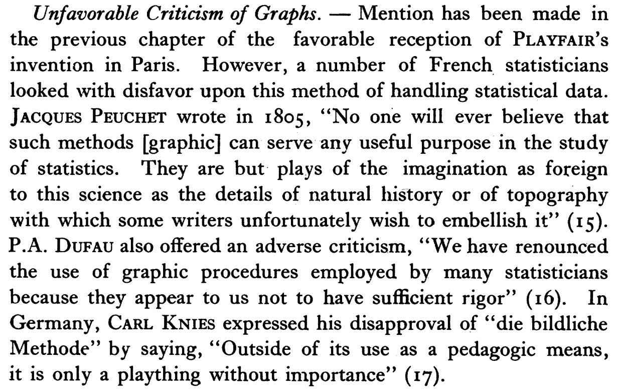
Statistics is a well grounded field but is composed of several subfields such as descriptive statistics, classical statistics (also called confirmatory statistics), Bayesian statistics and Exploratory Data Analysis. In the early 19th century, charts have been severely criticized (unfavorable) ( see the article scan). but Information Visualization is sometimes considered as a descendant and expansion of Exploratory Data Analysis.
The differences between the statistics subfields are the methods and the nature of the answer they seek. All of them start with a problem and gathered data that is related to the problem to solve. Classical analysis starts by designing a model of the data, then uses mathematical analysis to test whether the model is refuted or not by the data to conclude positively or negatively. The main challenge for classical statistics is to find a model.
Exploratory Data Analysis performs an analysis using visual methods to acquire insights of what the data looks like, usually to find a model. It uses visual exploration methods to get the insights.
So why is visualization useful before the modeling? Because, there are cases when we have no clear idea on the nature of the data and have no model.
To show why visualization can help finding a model, Anscombe in (anscombe) has designed four datasets that exhibit the same statistical profile but are quite different in shape, as shown in Figure 6. They have the following characteristics (See this link for details):
- mean of the x values = 9.0
- mean of the y values = 7.5
- equation of the least-squared regression line is: y = 3 + 0.5x
- sums of squared errors (about the mean) = 110.0
- regression sums of squared errors (variance accounted for by x) = 27.5
- residual sums of squared errors (about the regression line) = 13.75
- correlation coefficient = 0.82
- coefficient of determination = 0.67.
| I | II | III | IV | ||||
| x | y | x | y | x | y | x | y |
| 10.0 | 8.04 | 10.0 | 9.14 | 10.0 | 7.46 | 8.0 | 6.58 |
| 8.0 | 6.95 | 8.0 | 8.14 | 8.0 | 6.77 | 8.0 | 5.76 |
| 13.0 | 7.58 | 13.0 | 8.74 | 13.0 | 12.74 | 8.0 | 7.71 |
| 9.0 | 8.81 | 9.0 | 8.77 | 9.0 | 7.11 | 8.0 | 8.84 |
| 11.0 | 8.33 | 11.0 | 9.26 | 11.0 | 7.81 | 8.0 | 8.47 |
| 14.0 | 9.96 | 14.0 | 8.10 | 14.0 | 8.84 | 8.0 | 7.04 |
| 6.0 | 7.24 | 6.0 | 6.13 | 6.0 | 6.08 | 8.0 | 5.25 |
| 4.0 | 4.26 | 4.0 | 3.10 | 4.0 | 5.39 | 19.0 | 12.50 |
| 12.0 | 10.84 | 12.0 | 9.13 | 12.0 | 8.15 | 8.0 | 5.56 |
| 7.0 | 4.82 | 7.0 | 7.26 | 7.0 | 6.42 | 8.0 | 7.91 |
| 5.0 | 5.68 | 5.0 | 4.74 | 5.0 | 5.73 | 8.0 | 6.89 |

Figure 6: Anscombe’s Quartet
Visualization is much more effective at showing the differences between these datasets than statistics. Although the datasets are synthetic, Anscombe's Quartet demonstrates that looking at the shape of the data is sometimes better than relying on statistical characterizations alone.
5.2 Look at Your Data
In a heavily cited article called ``Statistical Methods in Psychology Journals'' (Wilkinson99statisticalmethods), Wilkinson warns statisticians:
And later:
He then describes and example using data from an unpublished American National Survey. Figure W shows a scatter-plot matrix of 3 variables (AGE, SEX, and TOGETHER meaning number of years in relationship).

Figure W: Scatter-plot matrix showing some anomalies
5.3 Data Mining
More than statistics, the goal of data mining is to automatically find interesting facts in large datasets. It is thus legitimate to wonder whether data mining, as a competitor of InfoVis, can overcome and replace the visual capacity of humans.
This question has been addressed by Spence and Garrison in (Spence) where they describe a simple plot called the Hertzsprung Russell Diagram (Figure 7). It represents the temperature of stars on the X axis and their magnitude on the Y axis. Asking a person to summarize the diagram produces Figure 7. It turns out that no automatic analysis method has been able to find the same summarization, due to the noise and artifacts on the data such as the vertical bands.


Figure 7: Hertzsprung Russell Diagram and its standard interpretation
Our vision system has evolved with the human specie to help us survive in a hostile world. We train it to avoid obstacles since we learn how to walk. It remains remarkably effective at filtering-out noise from useful data, a very important capability for hunters in deep forests to distinguish the prey moving behind leaves. We have relied on it and trained it to survive for millennia and it still surpasses automatic data mining methods to spot interesting patterns. Data mining still needs to improve to match these pattern matching capabilities.
5.4 Ulam Spiral
The Ulam Spiral is a method of visualizing the prime numbers discovered by chance by the mathematician Stanislaw Ulam in 1963.
The spiral is constructed on a regular rectangular grid of numbers, starting with 1 at the center, and spiraling out. As shown in Figure U, prime numbers are very often aligned on diagonals, which is unexpected and unexplained but leads to the development of new methods for generating or testing prime numbers. Visualization was required to discover this phenomena that scales to very large sizes.

Figure U: Ulam spiral of size 200×200. Black dots represent prime numbers. Diagonal, vertical, and horizontal lines with a high density of prime numbers are clearly visible. (Image from Wikipedia Commons)
5.5 Automating or Not?
Is there a competition between confirmatory, automated and exploratory methods? No, they answer different questions. When a model is known in advance or expected, using statistics is the right method. When a dataset becomes too large to be visualized directly, automating some analysis is required. When exploring a dataset in search of insights, information visualization should be used, possibly in conjunction with data mining techniques if the dataset is too large.
Furthermore, combining data mining with visualization is the central issue of Visual Analytics, described by the paper Visual Analytics: Definition, Process, and Challenges in the book Information Visualization: Human-Centered Issues and Perspectives.
6. An Economical Model of Value
One important question is how to assess the value of visualization, ranging from the evaluation of one specific use-case to the discipline in general. If we know how to do this, then this might lead to an assesment of the current status as well as the identification of success factors. An attempt was given by van Wijk (vanwijk05) and is summarized here. After a short overview of his model, we discuss how this model can be applied for InfoVis.
Visualization can be considered as a technology, a collection of methods, techniques, and tools developed and applied to satisfy a need. Hence, standard technological measures apply: Visualization has to be effective and efficient. To measure these, an economic point of view is adopted. Instead of trying to understand why visualization works (see previous sections), here visualization is considered from the outside, and an attempt is made to measure its profit. The profit of visualization is defined as the difference between the value of the increase in knowledge and the costs made to obtain this insight. Obviously, in practice these are hard to quantify, but it is illuminating to attempt so. A schematic model is considered: One visualization method is used by
users to visualize a data set
times each, where each session takes
explorative steps. The value of an increase in knowledge (or insight) has to be judged by the user. Users can be satisfied intrinsically by new knowledge, as an enrichment of their understanding of the world. A more pragmatic and operational point of view is to consider if the new knowledge influences decisions, leads to actions, and, hopefully, improves the quality of these. The overall gain now is
, where
represents the value of the increase in knowledge.
Concerning the costs for the use of (a specific) visualization , these can be split into various factors. Initial research and development costs
have to be made; a user has to make initial costs
, because he has to spend time to select and acquire
, and understand how to use it; per session initial costs
have to be made, such as conversion of the data;
and finally during a session a user makes costs
, because he has to spend time to watch and understand the visualization, and interactively explore the data set. The overall profit now is
In other words, this leads to the obvious insight that a great visualization method is used by many people, who use it routinely to obtain highly valuable knowledge, while having to spend little time and money on hardware, software, and effort. And also, no alternatives that are more cost-effective should be available.
In the original paper a number of examples of more or less successful visualization methods are given, viewed in terms of this model. One InfoVis application was considered: SequoiaView, a tool to visualize the contents of a hard disk, using cushion treemaps (vanwijk99). The popularity of this tool can be explained from the concrete and useful insights obtained, as well as the low costs in all respects associated with its application.
When we consider InfoVis in general, we can also come to positive
conclusions for almost all parameters, and hence predict a bright
future for our field. The number of potential users is very
large. Data in the form of tables, hierarchies, and networks is
ubiquitous, as well as the need to get insight in these. This holds
for professional applications, but also for private use at home. Many
people have a need to get an overview of their email, financial
transfers, media collections, and to search in external data bases,
for instance to find a house, vacation destination, or another product
that meets their needs. Methods and techniques from InfoVis, in the
form of separate tools or integrated in custom applications, can be
highly effective here to provide such overviews. Also, many of these
activities will be repeated regularly, hence both and
are
high. The growing field of Casual InfoVis (Pous07) further
illustrates how InfoVis techniques are becoming more common in
people's everyday lives.
The costs that have to be made to understand visualizations depend on the prior experience of the users as well as the complexity of the imagery shown. On the positive side, the use of graphics to show data is highly familiar, and bar-charts, pie-charts, and other forms of business graphics are ubiquitous. On the other hand, one should not overestimate familiarity. The scatterplot seems to be at the boundary: Considered as trivial in the InfoVis community, but too hard to understand (if the horizontal axis does not represent time) by a lay-audience, according to Matthew Ericson, deputy graphics director of the New York Times in his keynote presentation at IEEE InfoVis 2007. Visual literacy is an area where more work can be done, but on the other hand, InfoVis does have a strong edge compared to non-visual methods here. And, there are examples of areas where complex visual coding has been a great success, with the invention of the script as prime example.
The costs per session and
per user can be reduced by tight
integration with applications. The average user will not be interested
in producing visualizations, her focus will be on solving her own
problem, where visualization is one of the means to this end. Separate
InfoVis tools are useful for specialists, which use them on a
day-to-day basis. For many other users, integration within their
favourite tool is much more effective. An example of an environment
that offers such a tight integration is the ubiquitous spreadsheet,
where storage, manipulation, and presentation of data are offered; or
the graphs and maps shown on many web sites (and newspapers!) to show
data. From an InfoVis point of view, the presentations offered here
can often be improved, and also, the interaction provided is often
limited. Nevertheless, all these examples acknowledge the value of
visualization for many applications.
The initial costs for new InfoVis methods and techniques roughly fall into two categories: Research and Development. Research costs can be high, because it is often hard to improve on the state of the art, and because many experiments (ranging from the development of prototypes to user experiments) are needed. On the other hand, when problems are addressed with many potential usages, these costs are still quite limited. Development costs can also be high. It takes time and effort to produce software that is stable and useful under all conditions, and that is tightly integrated with its context, but here also one has to take advantage of the large potential market. Development and availability of suitable middleware, for instance as libraries or plug-ins that can easily customized for the problem at hand is an obvious route here.
One intriguing aspect here is how much customization is needed to solve the problem concerned. On one hand, in many applications one of the standard data types of InfoVis is central (table, tree, graph, text), and when the number of items is not too high, the problem is not too hard to solve. On the other hand, for large numbers of items one typically has to exploit all a priori knowledge of the data set and tune the visualization accordingly; also, for applications such as software visualizations all these data types pop up simultaneously, which also strongly increases the complexity of the problem. So, for the time being, research and innovation will be needed to come up with solutions for such problems as well.
In conclusion, graphics has been adopted already on a large scale to communicate and present abstract data, which shows that its value has been acknowledged, and we expect that due to the increase in size and complexity of data available, the need for more powerful and effective information visualization methods and techniques will only grow.
7. Conclusion
In this document, we have described the challenges in identifying and communicating the value of InfoVis. We have cited and posed a number of answers to the questions, ``How and why is InfoVis useful?'' Hopefully, the examples shown in the paper provide convincing arguments about InfoVis' value as an analytic tool. Ultimately, however, we believe that it is up to the community of InfoVis researchers and practitioners to create techniques and systems that clearly illustrate the value of the field. When someone has an InfoVis system that they use in meaningful and important ways, this person likely will not need to be convinced of the value of InfoVis.
8. References
| H. G. Funkhouse (1937) Historical development of the graphical representation of statistical data. Osiris, 1937. | bibtex | ||
| Leland Wilkinson (1999) Statistical methods in psychology journals: guidelines and explanations. American Psychologist, 54:594–604, 1999. | url bibtex | ||
| Jill H. Larkin and Herbert A. Simon (1987) Why a diagram is (sometimes) worth 10,000 words. Cognitive Science, 11:65–100, 1987. | bibtex | ||
| Kenneth R. Koedinger and John R. Anderson (1990) Abstract Planning and Perceptual Chunks: Elements of Expertise in Geometry. Cognitive Science, 14(4):511–550, 1990. | bibtex | ||
| F.J. Anscombe (1973) Graphs in Statistical Analysis. American Statistician, 27(1):17–21, February 1973. | url bibtex | ||
| I. Spence and R. F. Garrison (1993) A remarkable scatterplot. The American Statistician, 1993. | bibtex | ||
| Edward R. Tufte (1983) The Visual Display of Quantitative Information. Graphics Press, "Box 430, 1983. | bibtex | ||
| Edward R. Tufte (1990) Envisioning Information. Graphics Press, "Box 430, 1990. | bibtex | ||
| Edward R. Tufte (1997) "Visual Explanations: Images and Quantities. Graphics Press, "Box 430, 1997. | bibtex | ||
| Claude E. Shannon and Warren Weaver (1963) A Mathematical Theory of Communication. University of Illinois Press, Champaign, IL, USA, 1963. | bibtex | ||
| Christopher Williamson and Ben Shneiderman (1992) The dynamic HomeFinder: evaluating dynamic queries in a real-estate information exploration system. In SIGIR ’92: Proceedings of the 15th annual international ACM SIGIR conference on Research and development in information retrieval. New York, NY, USA. ACM, pages 338–346, 1992. | doi bibtex | ||
| Kurt Koffa (1935) Principles of Gestalt Psychology. Routledge & Kegan Paul Ltd. London, 1935. | bibtex | ||
| Colin Ware (2004) Information Visualization: Perception for Design. Morgan Kaufmann Publishers Inc. San Francisco, CA, USA, 2004. | bibtex | ||
| "Triesman (1985) Preattentive Processing in Vision. "Computer Vision, 31(2):156–177, August 1985. | bibtex | ||
| Martin Wattenberg and Jesse Kriss (2006) Designing for Social Data Analysis. IEEE Transactions on Visualization and Computer Graphics, 12(4):549–557, 2006. | bibtex | ||
| Jarke J. van Wijk (2005) The Value of Visualization. In Proceedings IEEE Visualization 2005., pages 79–86, 2005. | bibtex | ||
| Jarke J. van Wijk and Huub van de Wetering (1999) Cushion Treemaps. In Proceedings 1999 IEEE Symposium on Information Visualization (InfoVis’99). IEEE CS Press, pages 73–78, 1999. | bibtex | ||
| Karl R. Popper (1959) The Logic of Scientific Discovery. New York, Basic Books, 1959. | bibtex | ||
| Brian Johnson and Ben Shneiderman (1991) Tree-Maps: a space-filling approach to the visualization of hierarchical information structures. In VIS ’91: Proceedings of the 2nd conference on Visualization ’91. Los Alamitos, CA, USA. IEEE Computer Society Press, pages 284–291, 1991. | bibtex | ||
| Andreas Noack (2005) Energy-Based Clustering of Graphs with Nonuniform Degrees. In Patrick Healy and Nikola S. Nikolov, eds., Proceedings of the 13th International Symposium on Graph Drawing (GD 2005). Limerick, Ireland. Springer-Verlag, pages 309–320, 2005. | bibtex | ||
| Adam Perer and Ben Shneiderman (2008) Integrating Statistics and Visualization: Case Studies of Gaining Clarity during Exploratory Data Analysis. In SIGCHI Conference on Human Factors in Computing Systems (CHI 2008). ACM Press, 2008. | bibtex | ||
| Peter McLachlan, Tamara Munzner, Eleftherios Koutsofios, and Stephen North (2008) LiveRAC: Interactive Visual Exploration of System Management Time-Series Data. In SIGCHI Conference on Human Factors in Computing Systems (CHI 2008). ACM Press, 2008. | bibtex | ||
| P. Saraiya, Chris North, V. Lam, and K. Duca (2006) An Insight-based Longitudinal Study of Visual Analytics. IEEE Transactions on Visualization and Computer Graphics, 12(6):1511–1522, 2006. | bibtex | ||
| (1998) "Readings in Information Visualization – Using Vision. ("Card, Eds.) Morgan Kaufmann, 1998. | bibtex | ||
| Catherine Plaisant (2004) The challenge of information visualization evaluation. In AVI ’04: Proceedings of the working conference on Advanced visual interfaces. ACM, pages 109–116, 2004. | bibtex | ||
| Donald A. Norman (1993) Things That Make Us Smart: Defending Human Attributes in the Age of the Machine. Addison-Wesley Longman Publishing Co., Inc. Boston, MA, USA, 1993. | bibtex | ||
| Ellen Voorhees and Donna Harman (2000) Overview of the Sixth Text Retrieval Conference. Information Processing and Management, 36(1):3–35, 2000. | bibtex | ||
| N. Chincor, D. Lewis, and L. Hirschman (1993) Evaluating Message Understanding Systems: An Analysis of the Third Message Understanding Conference (MUC-3). Computational Linguistics, 19(3):409–449, 1993. | bibtex | ||
| Zachary Pousman, John Stasko, and Michael Mateas (2007) Casual Information Visualization: Depictions of Data in Everyday Life. IEEE Transactions on Visualization and Computer Graphics, 13(6):1145–1152, 2007. | bibtex | ||
| Xia Lin (1997) Map Displays for Information Retrieval. Journal of the American Society for Information Science, 48(1):40–54, 1997. | bibtex | ||