The new page can be found here: https://www.aviz.fr/PREVis/
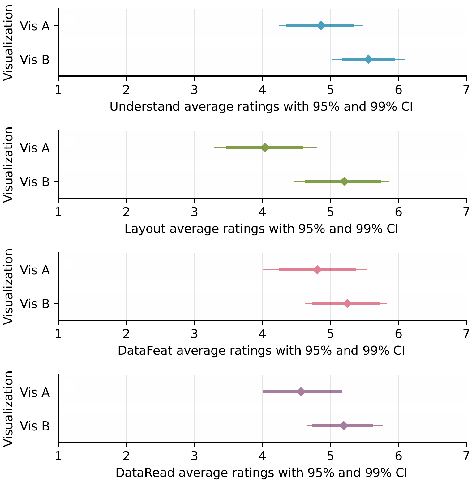
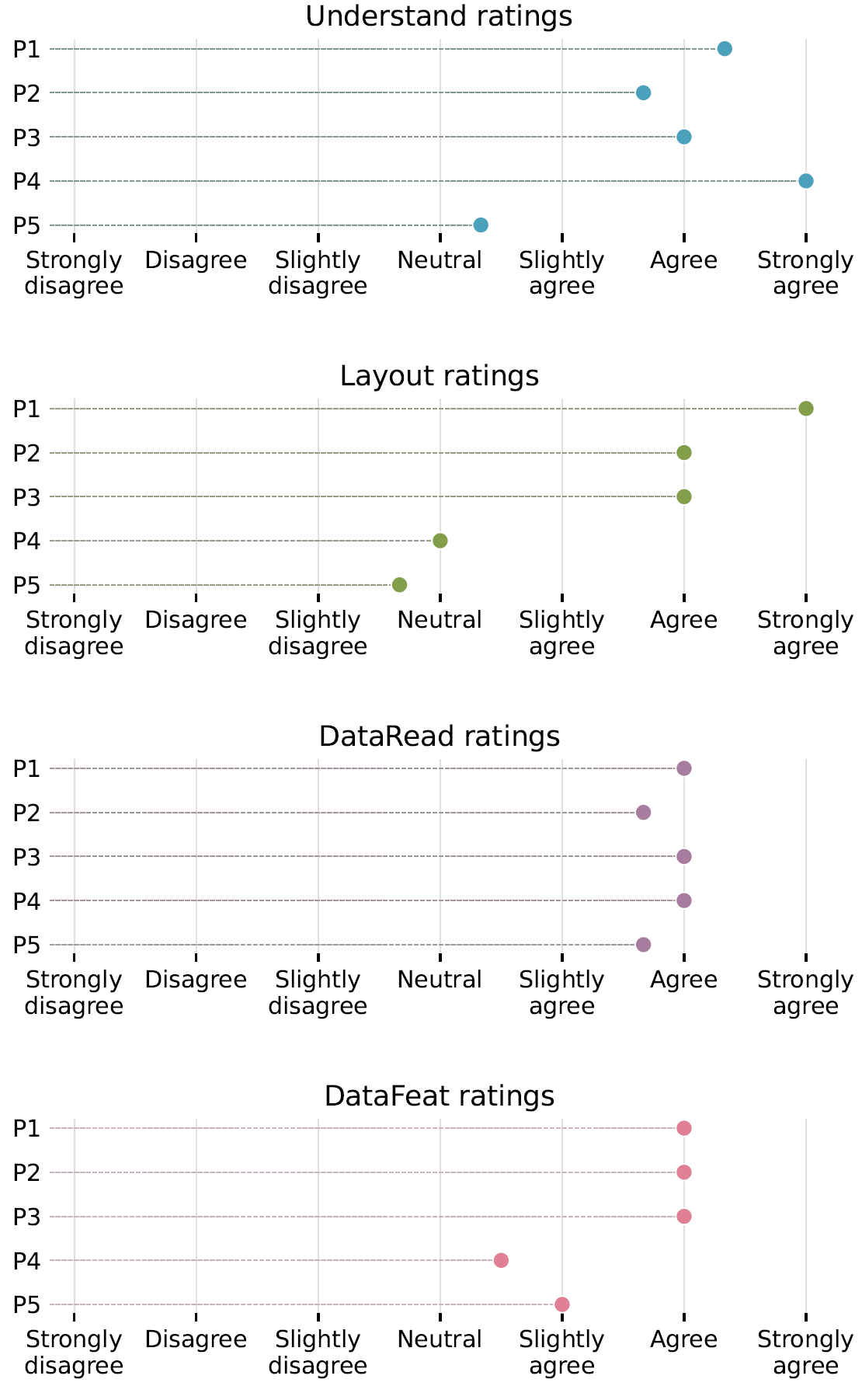
PREVis is a reliable instrument for measuring perceived readability in visualizations. It consists of 11 questions across 4 scales:
- UNDERSTAND: the intelligibility of the encodings for the reader
- LAYOUT: the visual clarity of the layout
- DATAREAD: how easily people feel they can read data points and values
- DATAFEAT: how easily people feel they can read data patterns such as trends, clusters, extremums, outliers, or ranges
What can I use PREVis for?
Data collected using PREVis can complement results from controlled experiments on user task performance to compared the readability of different visualizations. It can also provide additional data during in-depth qualitative work, for example during design iterations when developing a new visualization tool.
Why use PREVis?
- PREVis is easy and quick to administer: you can deploy PREVis online or on paper. Respondents can easily and quickly rate how readable they found a specific visualization.
- PREVis is reliable and validated: we developed PREVis following a rigorous scale development methodology, and we empirically validated the resulting questionnaire.
How to use PREVis?
We provide a full description of the instrument and use cases in a companion PDF on our OSF repository at osf.io/bdavt.
We also provide Python notebooks to plot the resulting data in our Github repository: github.com/AF-Cabouat/PREVis-scales
EXAMPLE 1: plotting PREVis ratings to complement task performance when comparing readability for two different visualizations:
EXAMPLE 2: plotting PREVis ratings to complement 5 interviews during the development of a new visualization:
Reference
Anne-Flore Cabouat, Tingying He, Petra Isenberg, and Tobias Isenberg. PREVis: Perceived Readability Evaluation for Visualizations. IEEE Transactions on Visualization and Computer Graphics, 31, 2025. To appear. doi: 10.1109/TVCG.2024.3456318


