Time Curves


What are time curves?
|
Upload your own data*
|
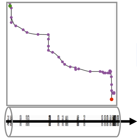
How do curves get folded?
Data Format
There are three simple cases:
Showing one curve
You have one data set and quickly want to show the curve. Upload on file in the format shown below.
{
	"distancematrix": [
	    [0, 0.7, 0.3],
	    [0.7, 0, 0.5],
	    [0.3, 0.5, 0]
 	],
	"data":[
		{"name":"name1",
		"timelabels": [
		    "2014-02-21 00:00:00.0",
		    "2014-02-22 00:00:00.0",
		    "2014-02-23 00:00:00.0"
		]}
	]
}
Showing multiple curves separated
You have multiple data sets that you want to visualize, but each one as individual curve. You can can upload multiple files using the data format above.
Showing multiple curves overlaid
You have multiple data sets that you want to compare. In order to be comparable, curves must be rendered in the same MDS space. You have to provide a distance matrix that contains similarity values for all pairs of time steps and across all data sets. So, if you have 2 curves with 3 time points each (see example below), the distance matrix must contain (2+3)^2 = 36 entries. The order of rows and columns in the distance matrix is the same as the concatenation of all time labels in the order of their data sets. In the example below, the cell at the 1th row, 4th column (value 0.2), is the distance between the 1st time point of the 1st data set and the 1st timepoint of the 2nd data set.
{
	"distancematrix": [
	    [0, 0.7, 0.3, 0.2, 0.1, 0.1],
	    [0.7, 0, 0.5, 0.2, 0.1, 0.1],
	    [0.3, 0.5, 0, 0.2, 0.1, 0.1],
	    [0.2, 0.2, 0.2, 0, 0.7, 0.4],
	    [0.2, 0.2, 0.2, 0.7, 0, 0.2],
	    [0.1, 0.1, 0.1, 0.4, 0.2, 0]
 	],
	"data":[
		{"name":"name1",
		"timelabels": [
		    "2014-02-21 00:00:00.0",
		    "2014-02-22 00:00:00.0",
		    "2014-02-23 00:00:00.0"
		]},
		{"name": "name2",
		"timelabels": [
		    "2014-02-21 00:00:00.0",
		    "2014-02-22 00:00:00.0",
		    "2014-02-23 00:00:00.0"
		]}
	]
}
More Examples
Stability and Reproducability
Since time curve and the patterns they show rely on the characterisitics of the underlying MDS algorithm, below we show examples that show how sensitive our MDS is, with respect to changes in the data.
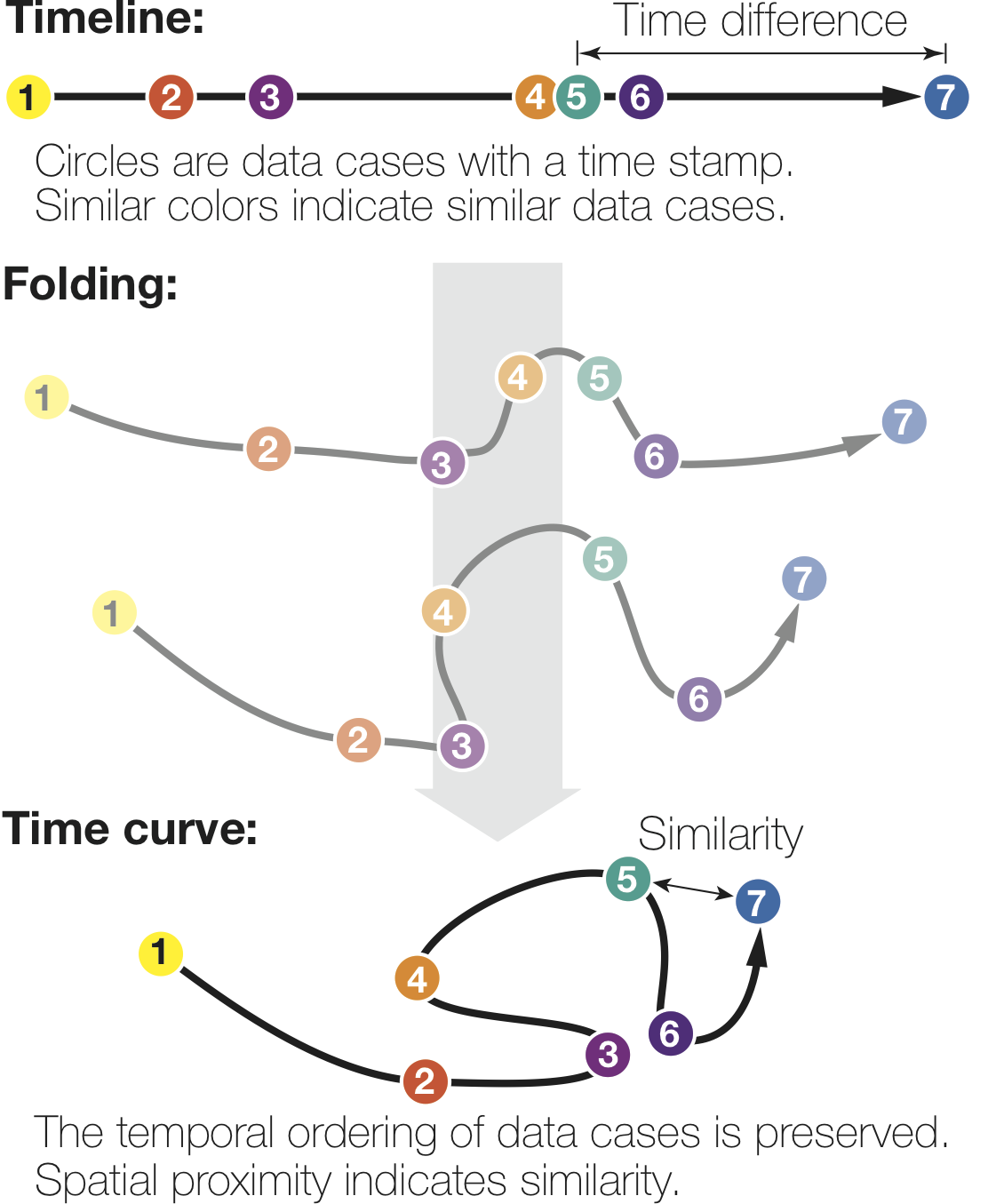
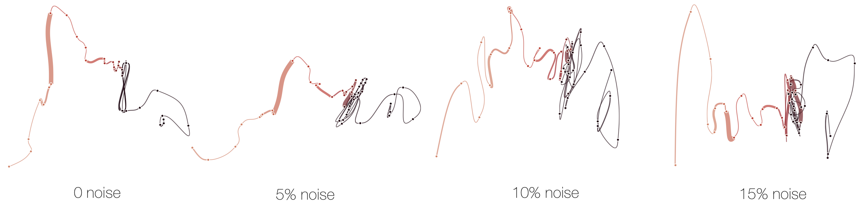
Reproducability
Below, we list exmaple curves generated from the exact same data set. The very similar curves prove that our used MDS algorithm produces the same visual results each time, i.e. it is deterministic.

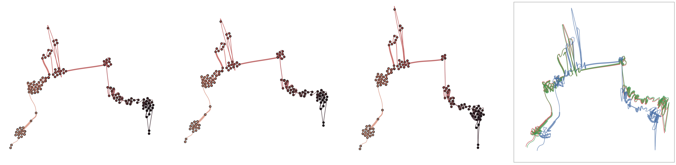
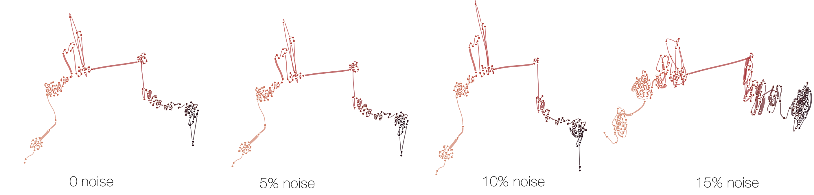
Sensitivitiy
Below, we demonstrate how sensitive time curves with our MDS are to noise. The examples show curves with gradually added gaussian noise (5%, 10%, 15%). The first curve is the original curve without noise.
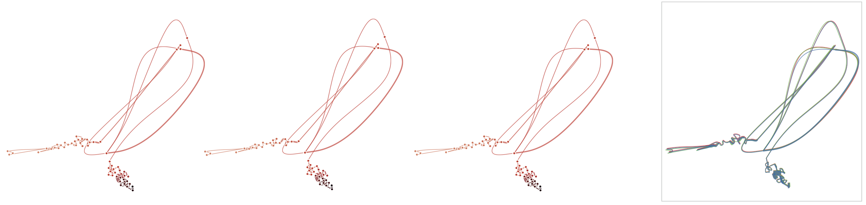
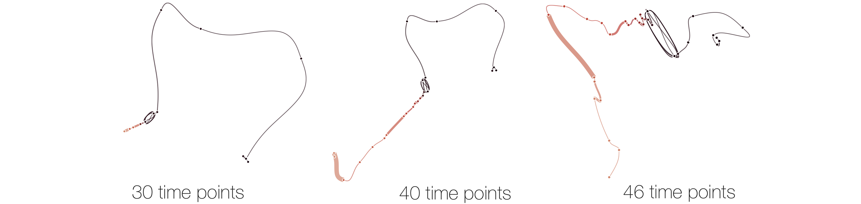
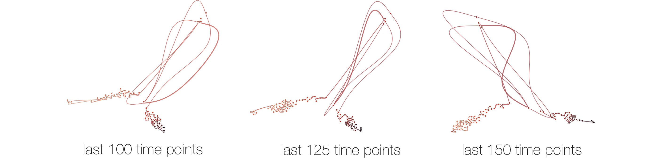
Stability
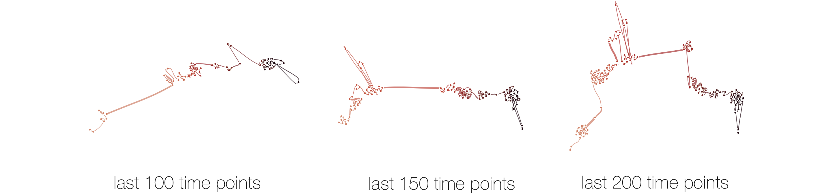
Below, we list example curves where (from left to right), versions have been added. The examples are Wikipedia articles, and with each curve we added older versions, i.e., to the beginning of the curve. However, since time is no parameter in our MDS, curves can theoretically be read back and forth.
The History of Time Curves
We implemented several building prototypes over the course of four years, and tried many different views and mappings. Here, we refer to some of them in the hope that they may inspire the work of others. The four prototypes where as follows.
Before there where time curves ...
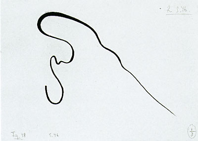 |
... there was Kandinsky. |
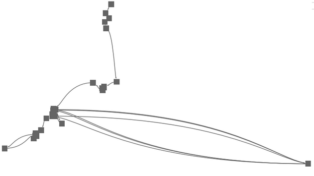
Force-directed Folding
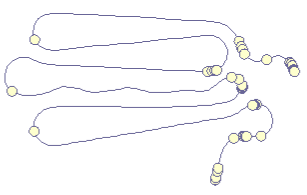 |
Our first prototype was an implementation of a simple force-directed algorithm that ties together points along the a timeline (left). The results seemed intuitive, especially since the folding technique directly reflected the metaphor of "folding" the timeline. En plus, users could watch the algorithm folding the curve together, hence delivering an animated transition from line to curve for free. |
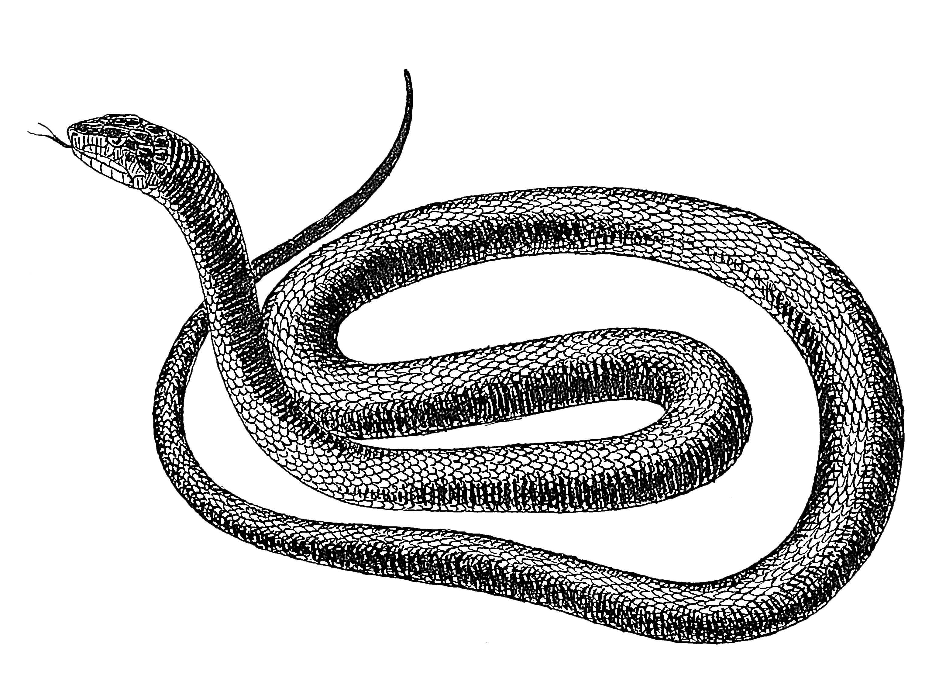 |
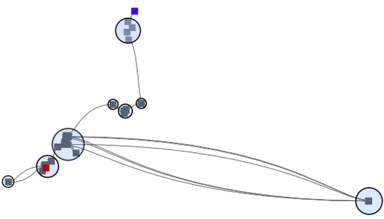
We were very much motivated by these first results but weren't sure how to interpret the curve's swings, especially since the curve did never intersect itself, but rather folded like a snake *. However, snakes have been reported to not always tell the truth. Yet, non-overlapping time curves are in fact unable to reflect the actual complexity of temporal evolution in data. Hence, we tried to find a way that would give a better represenatation of the similarity in the data. |
Multi Dimensional Scaling (MDS)
 |
MDS is quite a simple but intuitive method to project similarity between items into a 2D space. Contrary to PCA, a MDS layout does not have any axes with a meaning (the principal compoments). MDS is rotation invariant. As seen on the left, a pure MDS does not convey any temporal order of points, if there is any. |
 |
In connecting the pure MDS with a simple spline elements, we obtained a first MDS version of a time curve. Yet, time can still not be read, points overlap, and the curve is not very smooth, being hard to follow in any direction. |
 |
Since close points reflect similar versions, we tried to see them as ''clusters'' and highlight those clusters accordingly. But what is the meaning of these clusters? These clusters are binary artifacts of a clustering algorithm that somehow made the decission which time points go together and which do not. Yet, an advantage of folded time curves is that similarity and change is encoded in its visual characteristics, which can be interpreted by humans. I.e. close points are similar, and the closeness of points is somehow proportional to their similarity. This is the basic motivation for information visualzation and perhaps comparable to reading clusters from a graph layout; calculated clusters can be compliementary to a proper visualization. Thus, while clusters can be calculated for time curves, we wanted to focus on the intrinsic characteristics of the line itself and leave the analtical part for future work. However, part of what made us unsatisfied with the time curve on MDS is that information got lost due to the dimensional reduction. MDS is known for its artifacts, namely to place similar points far away, and unsimilar points colose. |
Similarity Matrices
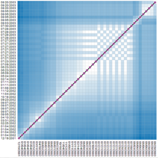 |
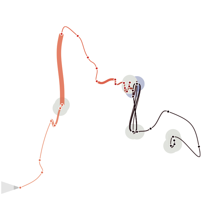
Similarity matrices show data elements as rows and colmns and share cells according to the element similarity. Such a representation does not hide any similarity information for any node pair. But, reading those matrices can be hard. On the left, we show a matrix where individual time points (here, revisions of a wikipedia article), are shown in their temporal order, from left to right (horizontal dimension), and from bottom to top (vertical dimension). Both dimensions contain the same time points. Dark cells indicate low similairty (high distance), bright cells indicate similar time points (low distance). The chess-board pattern indicates a period of similar and dissimilar revisions, thus an edit war. Clusters of similar revisions are shown as white blocks close to the diagonal. |
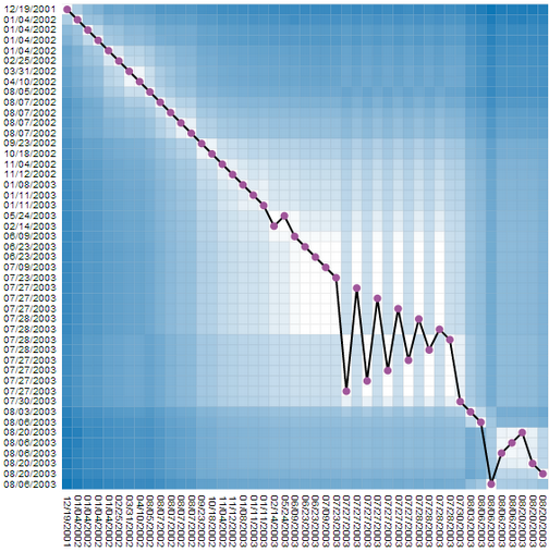 |
We found this representation hard to read, and tried to combine this very detailed but complicated representation with the much simpler, but necessarily less complete time curves. This, we added the timeline to the matrix, connecting all cells on the diagonal (which is equal to connecting time points). But, since now the line does not encode any information, we reordered the rows in the matrix according to their similarity. In order words, similar revisions where placed close, independent of time. Since temporal order was still kept on the vertical dimension (the columns) the result was a line that had some similarities with the time curves. The edit was is not clearly visible. Moreoever, this representaiton shows time, details about similarity for every node pair, plus a time curve that hints on the amount and type of change. |
 |
We also tried to remove the similarity matrix in this example to see if the line itself can be useful. Placing time steps on the horizontal dimension on an actual temporal scale, would further tell us how long a certain change took. Yet, here the edit war completely disappered, since it happened in a very short time period. |
Animated Transitions
The corpus of possible views grew steadily, and wile discussing and improving each view, we thought about actual animated transitions between the individual views: MDS, timeline, ordered matrix, initial similarity matrix. In fact, the design space seems to be continous with the timeline being the linking element that a user can follow during his exploration process. The problem was that navigating in the view space was not straight forward and we explored several widgets and navigation guidelines. | |
As for transtioning between a simple timeline that accuratly shows durations between events, and a time curve, we first implemented time as a weighed parameter in the MDS and changing the weight during the animating. However, this approach was computationally expensive (the MDS had to be computed for each animation step), and often resulted in jarring animations suffering from jitter and sometimes abrupt jumps. Since the intermediate stages between a regular timeline and time curve are not particularly meaningful, we finally decided to use a simple linear geometrical interpolation, as provided with the examples above. |
Improving Time Curves
|
We eventually decided to turn back to the very initial idea, the curve itself, and the natural characteristics of a line. We discarded all the matrix based views, Altough we still belive each individual view is interesting and tells something about the data, we think they are in fact too complicated to be navigated and understood by an average person. We wanted time curves to be as simple as possible, while the other views should be better integrated into a more wholistic analytical environment targeted to experts. |
 |
... to be continued :) |
Acknowledgements
*We would like to clarify that there are cases where a snake insects himself, and where snakes are shown intersecting.
* Your data will be uploaded onto our server at the french Inria research institute. Your data must be uploaded to be able to be processed by our layout algorithm. We do not store not circulate your data.
Icons made by Freepik from www.flaticon.com is licensed by CC BY 3.0